
Calm Market Waters Hide Fierce Undercurrents
Authored by Michael Lebowitz via RealInvestmentAdvice.com,
The price movement in the broad S&P 500 index is relatively calm. Yet the market’s undercurrent, as measured by sharply diverging returns across stock sectors and factors, is anything but calm. The current market picture we paint is well embodied by a quote from Jules Verne in 20,000 Leagues Under the Sea.
“The sea was perfectly calm; scarcely a ripple disturbed its surface. But beneath this tranquil exterior, powerful currents were flowing with irresistible force.”
Given this divergence between the calm market surface and the volatility of its underlying stocks’ returns, let’s get a better grip on the market’s undercurrent and decipher what it may be trying to tell us.
A Calm Market
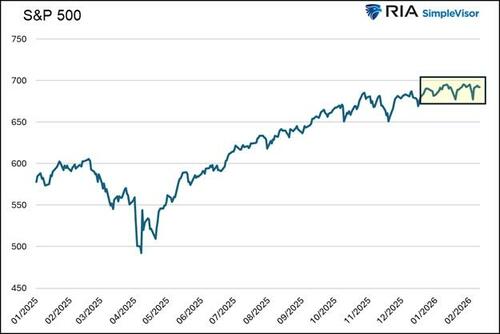
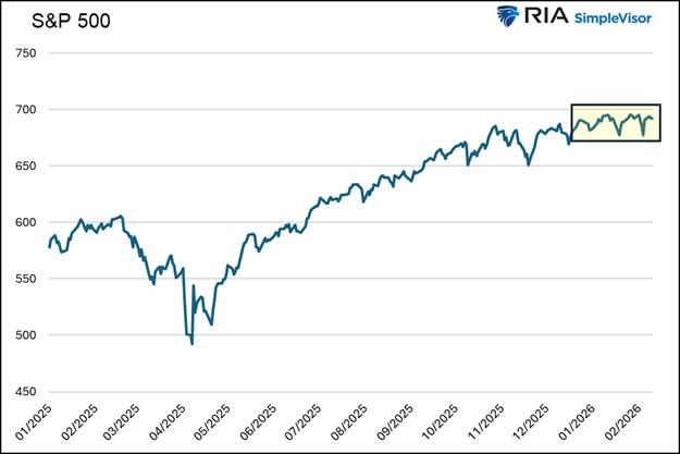
The graph below shows that the S&P 500’s upward trend has recently flattened into a tight range with minimal volatility. Such consolidation is common after a sharp upward price trend, as the market experienced since early April.
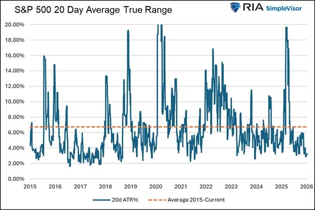
The next graph shows the average true range (ATR) for the index. ATR is a measure of realized volatility. As we define it, ATR is the percentage difference between the highest and lowest intraday prices over a rolling 20-day period. The current ATR is only about 3%, near the bottom of the range since 2015. It is also less than half the ten-year average.
Both charts point to a relatively calm market with limited volatility. It’s worth noting that implied volatility (expected volatility) on the S&P 500 is around 20. While not low, it doesn’t suggest that investors expect significant volatility in the weeks ahead.
The Markets Undercurrent
While the broad S&P 500 market index is relatively calm, its undercurrent is anything but tranquil. Significant rotation trades, characterized by heavy trading activity in and out of various sectors and factors, have led to large daily divergences in the performance of certain sectors and stock factors.
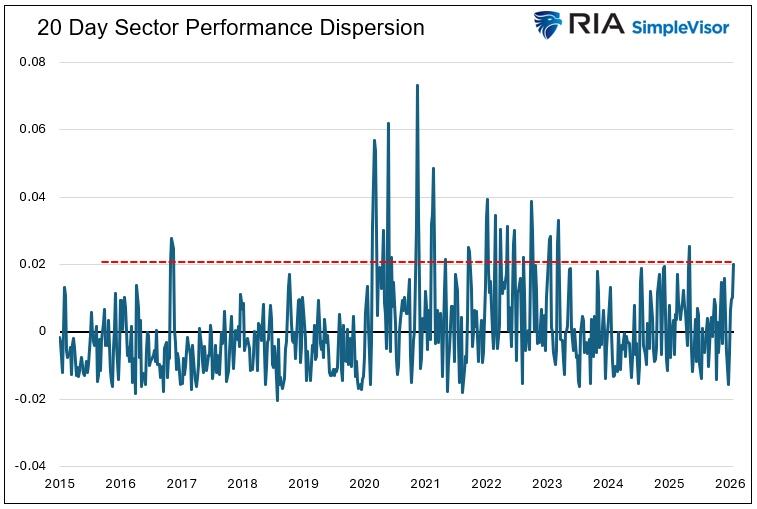
We use the dispersion of returns to quantify the market’s fierce undercurrent. For this article, we take the 20-day percentage price changes for sector and factor groups and then calculate the standard deviation of those changes. The more divergent the returns, the higher the standard deviation.
The first graph below shows that the current standard deviation of returns across all sectors is at its second-highest level since early 2023.
The following graph uses factors such as growth and value, market cap, and momentum. It also shows that returns among various factors are highly dispersed.
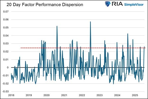
Next, we share a graph, courtesy of Nomura, that delves deeper into the recent dispersion. It compares the average move for all S&P 500 stocks over the last 20 days to that of the S&P 500 index. As the graph shows, the relative volatility of individual stock returns versus the market is now at levels last seen during the financial crisis and the dotcom crash.
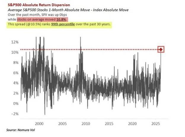
Cross-Sector Correlation
To further quantify the market’s strong undercurrent, we examine the correlation of returns among the S&P 500 sectors. The first table shows the correlation between the weekly returns thus far this year. The second table is for 2025.
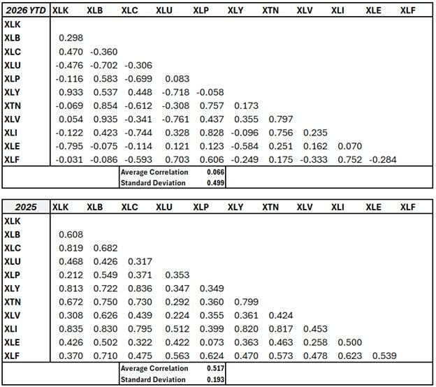
In 2026, the average correlation among all sectors is a mere 0.066, compared to the statistically significant 0.517 in 2025. Moreover, the standard deviation of the correlations is much greater this year than last year. This, as with the graphs above, further indicates that the various sectors are currently showing a large divergence in weekly returns compared to last year.
We also ran the average correlation from 2019 through 2025, including the tumultuous pandemic sell-off and sharp recovery, and arrived at an average correlation of .68 and a standard deviation of .175.
Our Takeaway
The market’s surface may look calm, but beneath it, passive investors are actively shifting between narratives, valuations, and risk exposures. This reflects changing sentiment among investors about economic growth, inflation, monetary and fiscal policy, and the current political leadership.
Historically, periods of elevated sector dispersion tend to occur during market transitions rather than steadily trending bull or bear markets. However, high dispersion after a long bullish trend is not automatically bearish. It may just represent the market searching for its next regime rather than distress.
Furthermore, as we shared, high sector and factor dispersion is occurring alongside low cross-sector correlations. Typically, correlations between stocks are high during periods of crisis. As the old saying goes, “correlations go to one during a crisis.”
Therefore, if correlations begin to rise and the market heads lower, the recent bout of high dispersion may not be a lasting shift in investor preferences but an omen of a downward trend.
Summary
Periods of high return dispersion are an opportunity for investors. As return performance gaps widen and valuation spreads develop, the ability to quantify the current rotation regime and anticipate the next one can deliver outperformance relative to the broader index.
While the calm market undercurrent is fierce, it is in and of itself not of great concern. But, as we noted earlier, if we start to see returns among sectors and factors become more aligned, especially downwardly, our concern will heighten.
Tyler Durden
Wed, 02/18/2026 – 14:15